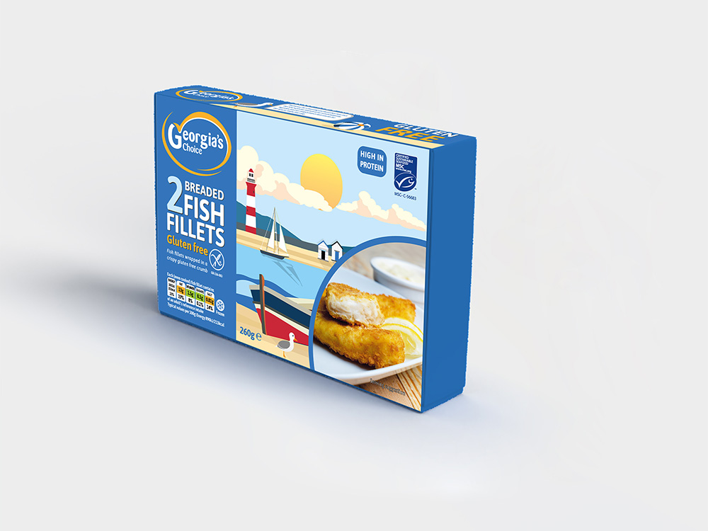
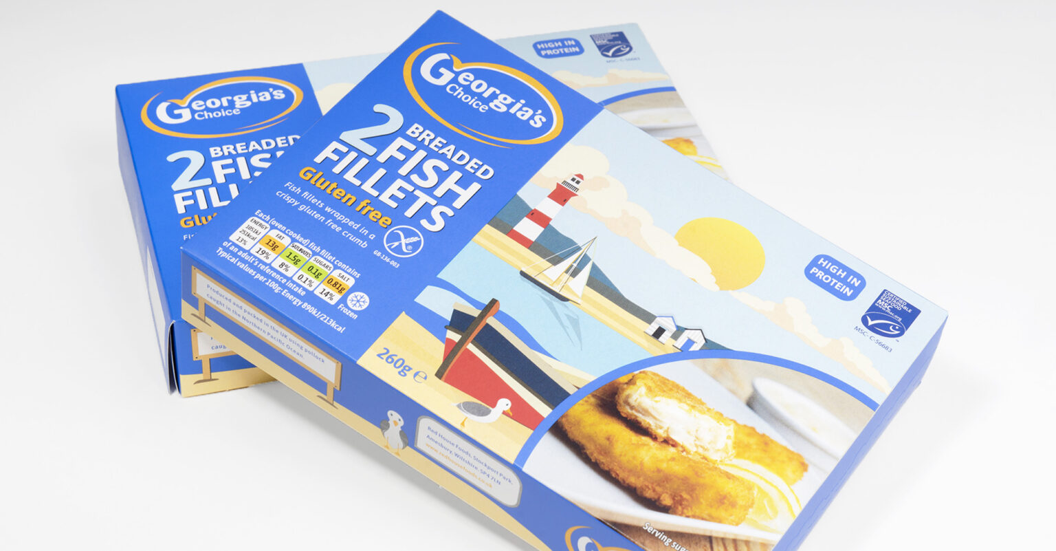
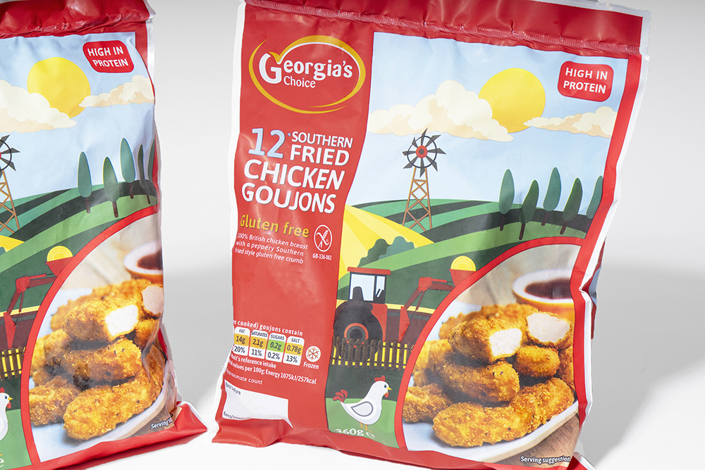
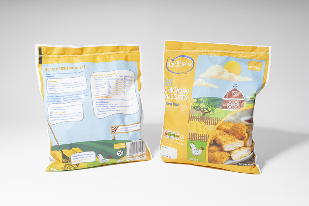
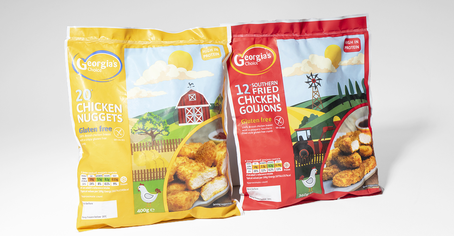
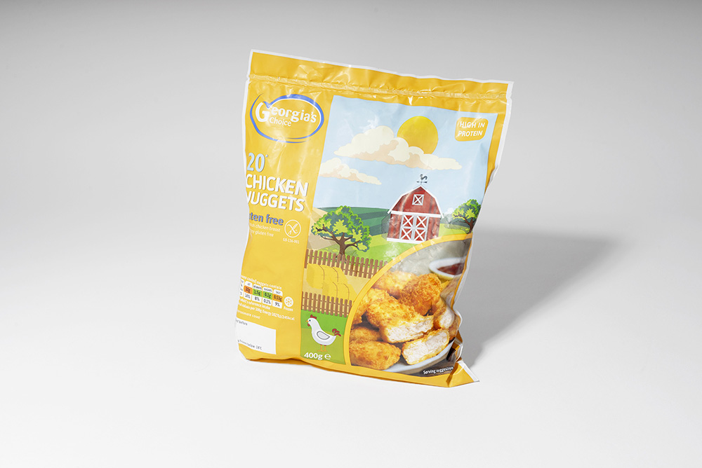
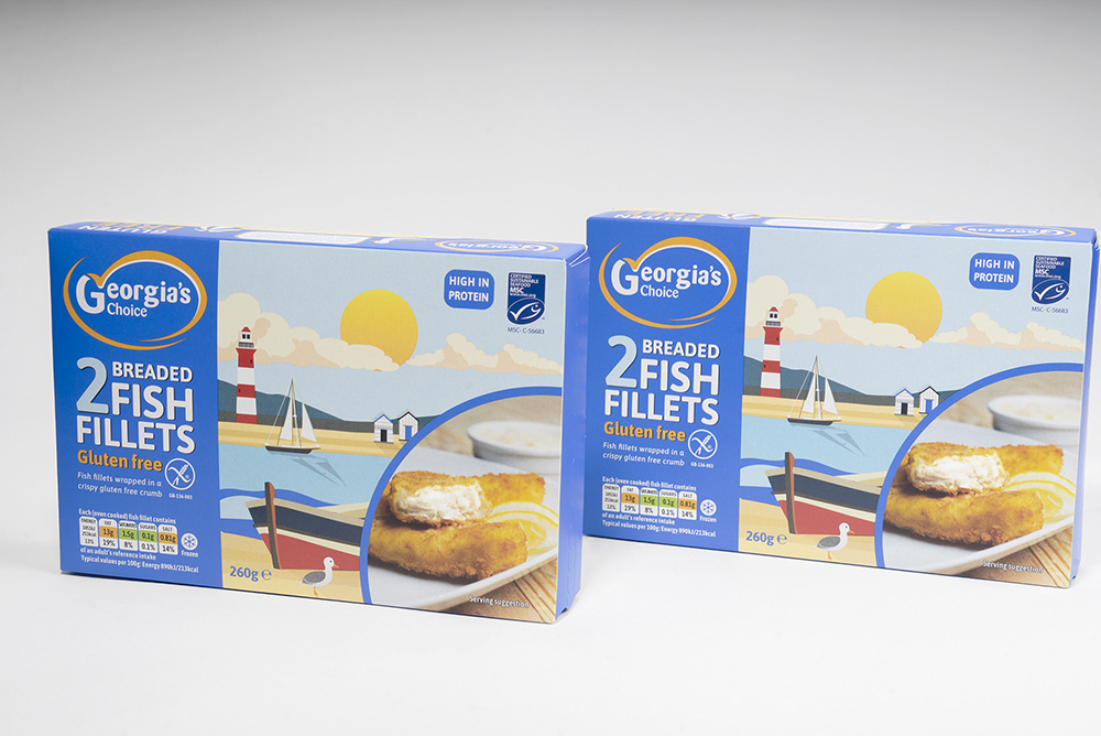
It was important that the new look differentiated Georgia’s Choice from other mainstream competitors and created shelf space in a busy retail aisle. To achieve this, our graphic design team analysed visual cues used by competitor brands and investigated current design trends. From this information, our graphic designers choose to use punchy backgrounds of red, yellow and blue seldomly used by other brands.
To further drive differentiation our graphic designers created a range of bespoke illustration vistas of the sea, countryside and a farm to be used as artwork on the packs. The logo was modernised but kept its original essence.